ST CLEMENTS
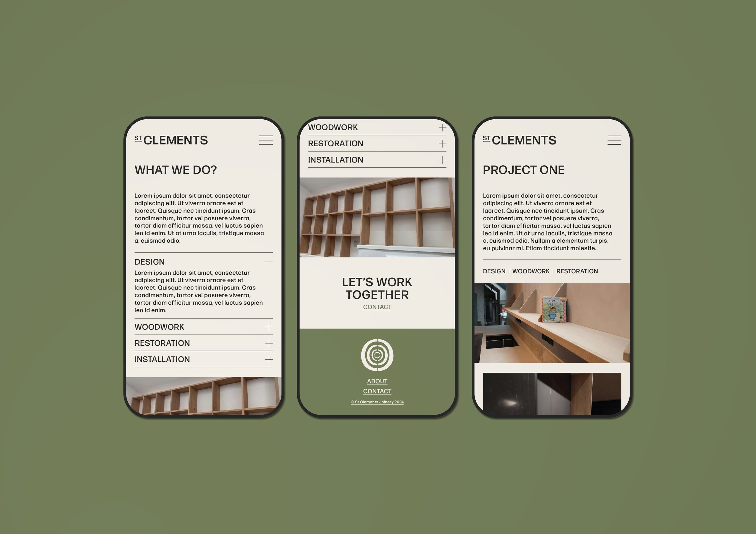
Visual Identity | Web Design
The St Clements visual identity system is for a local joinery company who wanted a wood stamp styled logo mark, that felt slightly uneven like wood rings. The clients work is very high-end and bespoke, we wanted to reflect this within the branding, creating a clean and classy system across business stationary, social media and their website portfolio.


